.svg)


.svg)


.svg)
.webp)

Watch
Reel
Reel
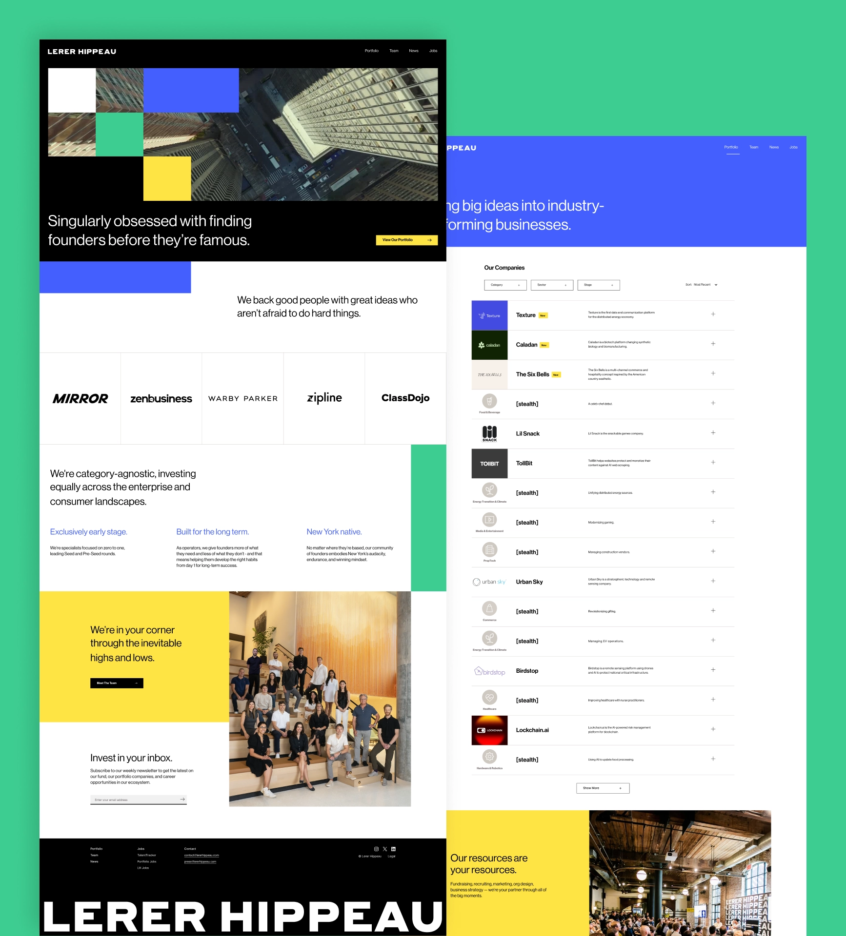
Lerer Hippeau is one of the most active early-stage venture firms in New York, with a growing portfolio spanning enterprise and consumer technology. As the firm’s investments, content, and public presence continued to expand, its website needed to evolve alongside them. Brickell was brought in to redesign and modernize the existing experience, creating a faster, more dynamic platform that better showcases the firm’s portfolio, highlights the people and companies behind its momentum, and reflects a more accessible approach to early-stage venture capital.
We began by supporting Lerer Hippeau’s existing digital presence, helping maintain and develop the site as the firm continued to grow its platform and public voice. This phase focused on evolving the experience within the existing framework, supporting core content areas and setting the stage for a more intentional next chapter.
That collaboration led into development of a new Webflow experience designed to better reflect the firm’s voice and momentum. Together, we built a refreshed site centered around clearer storytelling and more dynamic content across portfolio, team, news, and subscription touchpoints, resulting in a platform that feels more current, flexible, and distinctly LH.
.webp)
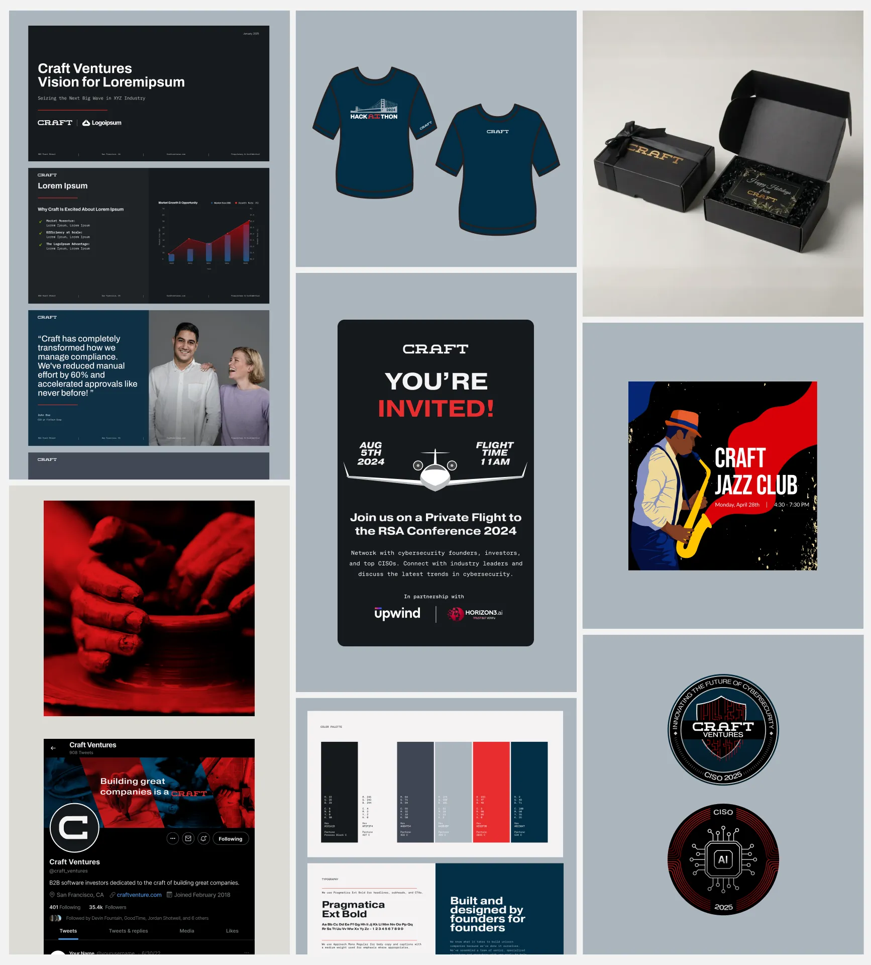
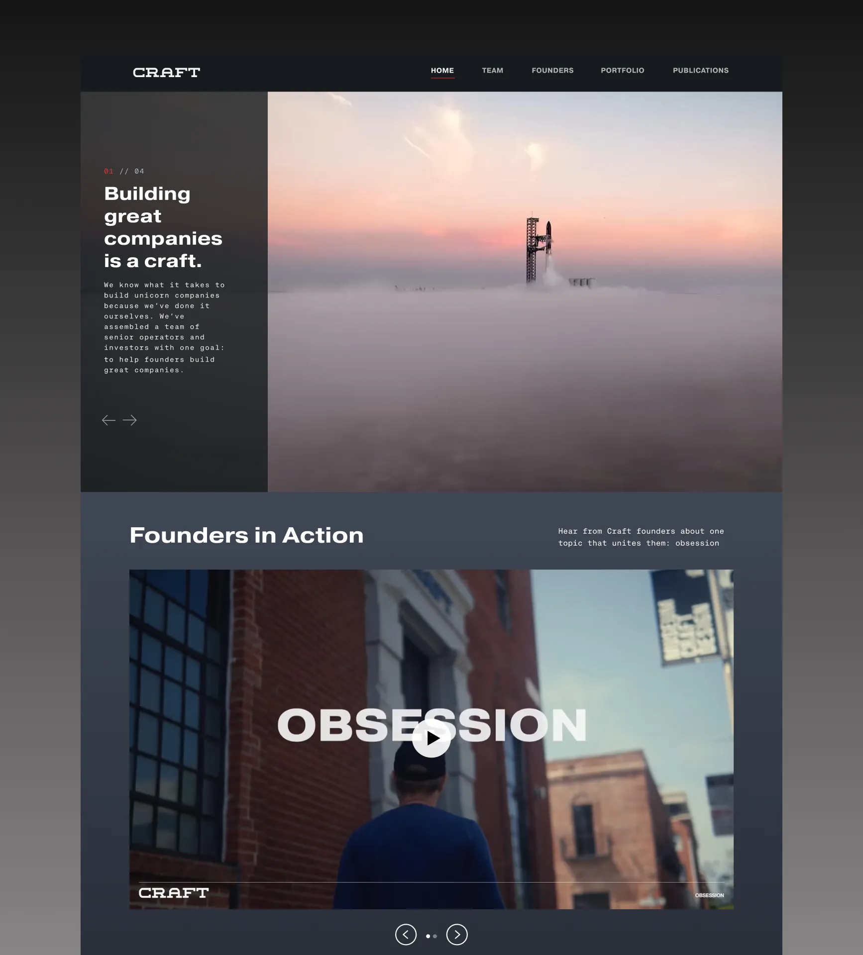
Our long-term partnership with Craft Ventures spans multiple phases of growth. Since 2023, we’ve worked alongside their team as a trusted go-to-market partner, supporting everything from website to platform, investment, marketing, and launch assets. As their needs evolved, we continued to adapt—helping Craft Ventures consistently show up with clarity, speed, and impact.
Craft partnered with us for initial onboarding, including website design support and visual assets for Craft Hackaithon—a collaborative initiative bringing technical teams together to build, ship, and compete. This phase laid the groundwork for a long-term partnership.
In 2024, we led a full website revamp and brand refresh for Craft—reworking key pages, tightening the narrative, and modernizing the visual system. We designed and developed the site in Webflow, ran A/B tests to validate performance improvements, and supported ongoing upkeep to keep the platform current as Craft’s initiatives evolved.
Our role expanded into ongoing support across Craft’s platform team and broader ecosystem. We delivered decks, web updates, social and event assets, and narrative support—while helping Craft’s portfolio companies translate complex products into clear positioning, GTM-ready messaging, and high-converting digital experiences.
We continue partnering with Craft as an embedded creative + development team—evolving key pages, refining narrative and positioning, and supporting ongoing platform initiatives. In parallel, we continue to support Craft’s portfolio with launch-ready brand systems, websites, and fundraising/GTM collateral as new investments and priorities emerge.
.webp)
.webp)
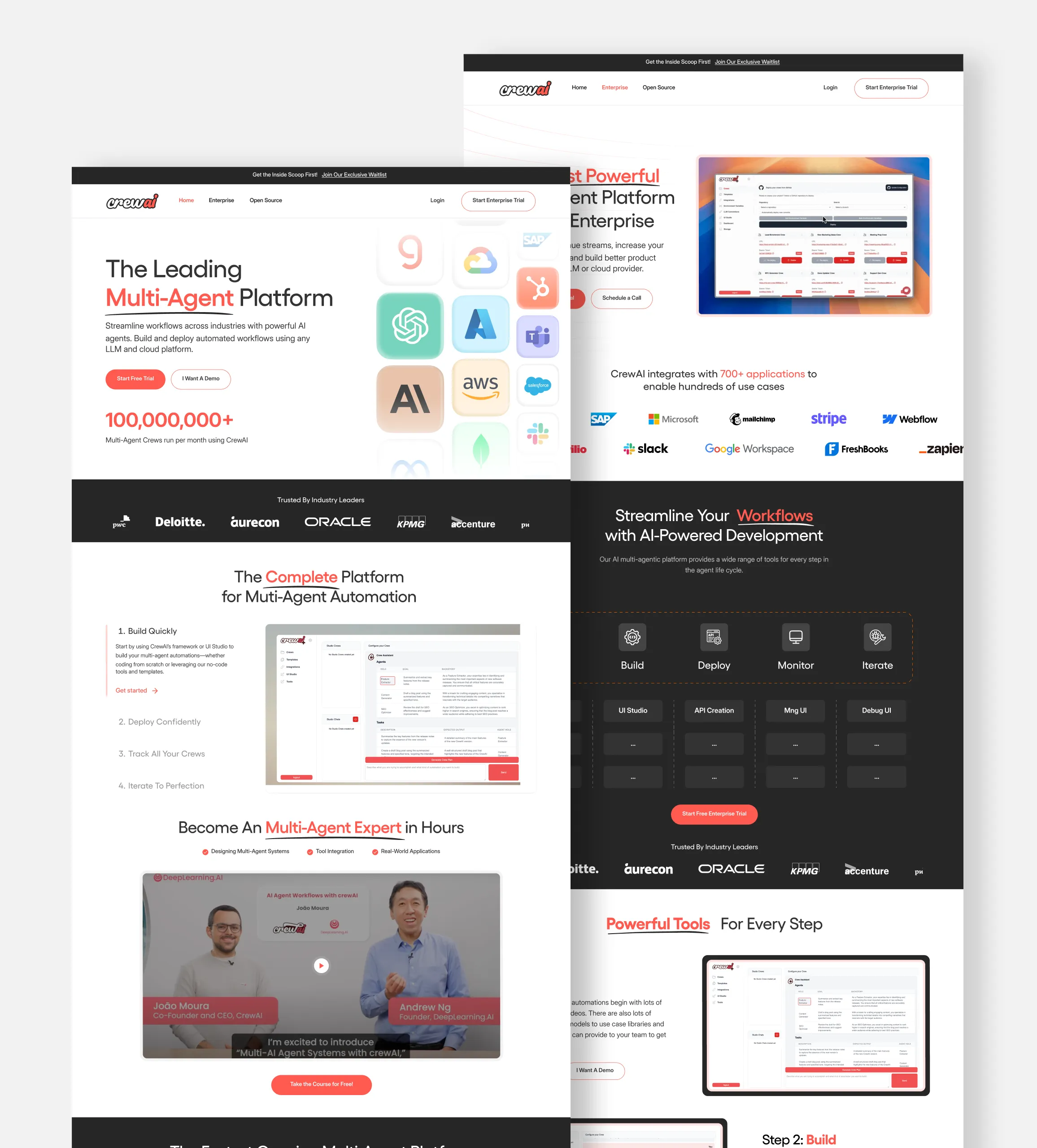
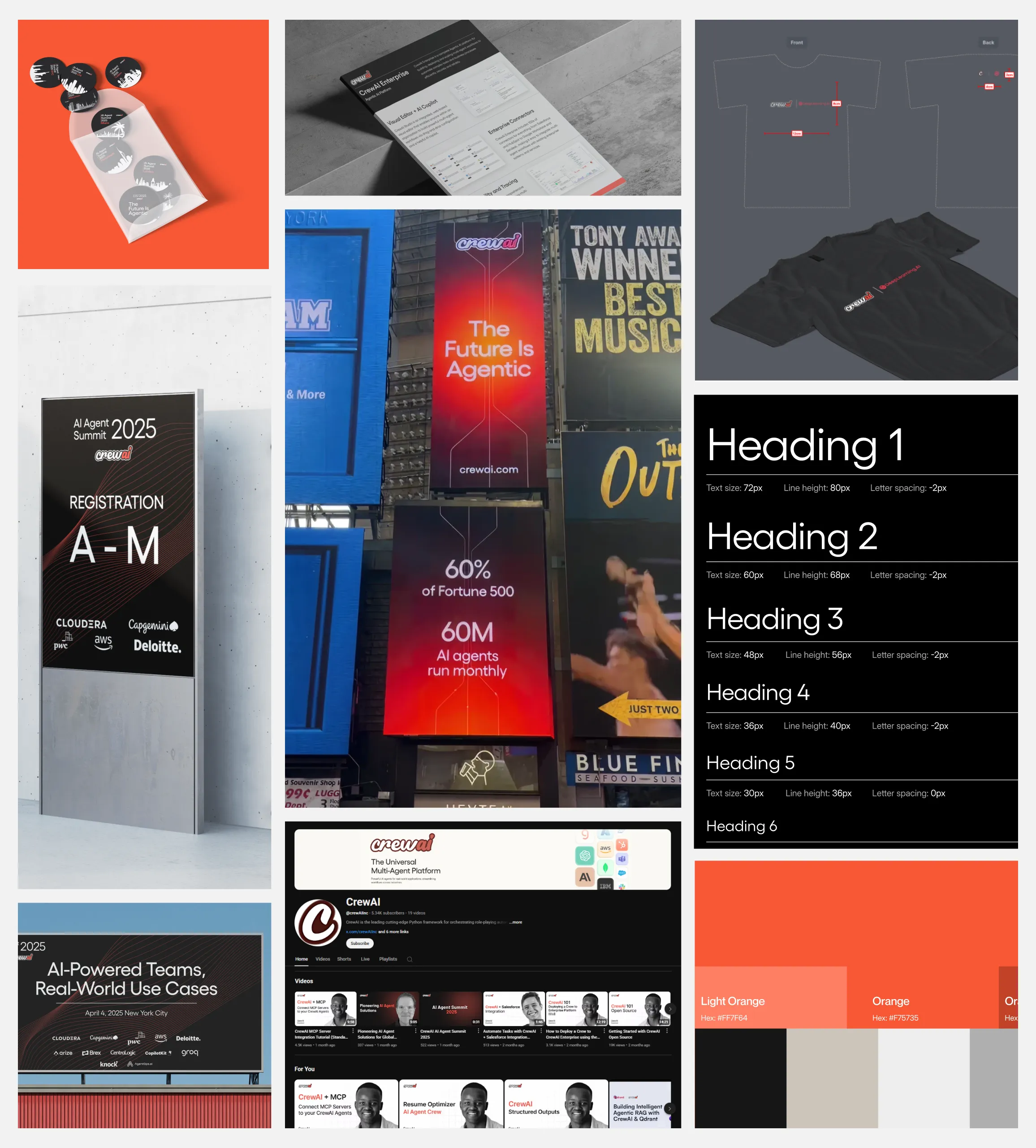
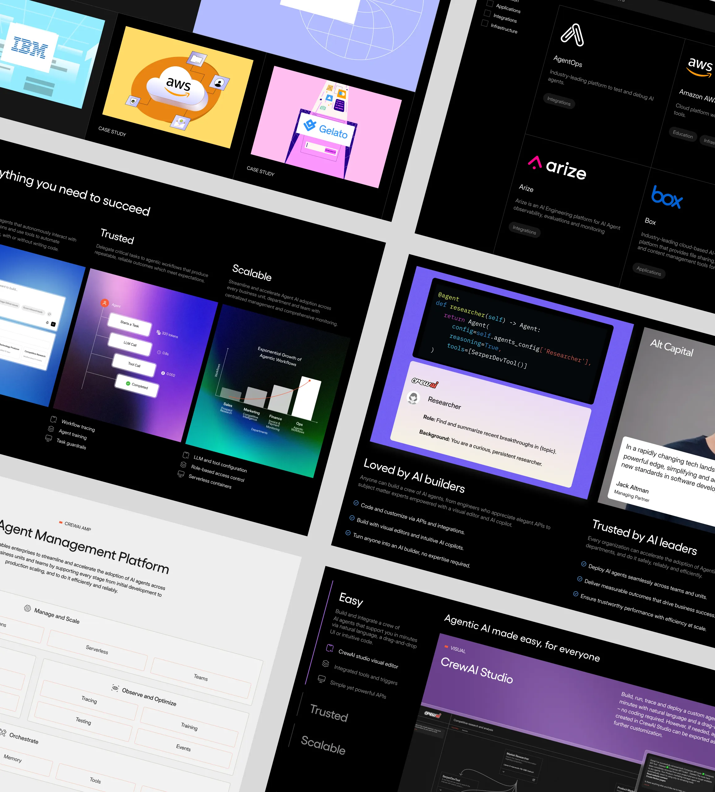
Our partnership with CrewAI evolved from an initial brand and website engagement into a long-term collaboration as they scaled in the Generative AI space. Today, we support their brand, website, and go-to-market presence as they lead the category.
CrewAI onboarded us for an initial brand and website engagement to sharpen their presence in the fast-moving Generative AI space. This first revamp established a clear narrative and set the foundation for their growing momentum.
As CrewAI scaled, our collaboration evolved into a full-time retainer. We became their go-to-market partner, supporting ongoing launches, brand assets, website updates, and strategic communications across every touchpoint.
With CrewAI emerging as an industry-leading Generative AI partner, we led a complete narrative and website overhaul once again. The refreshed brand positioned them clearly as category leaders, aligned with their enterprise growth and market authority.
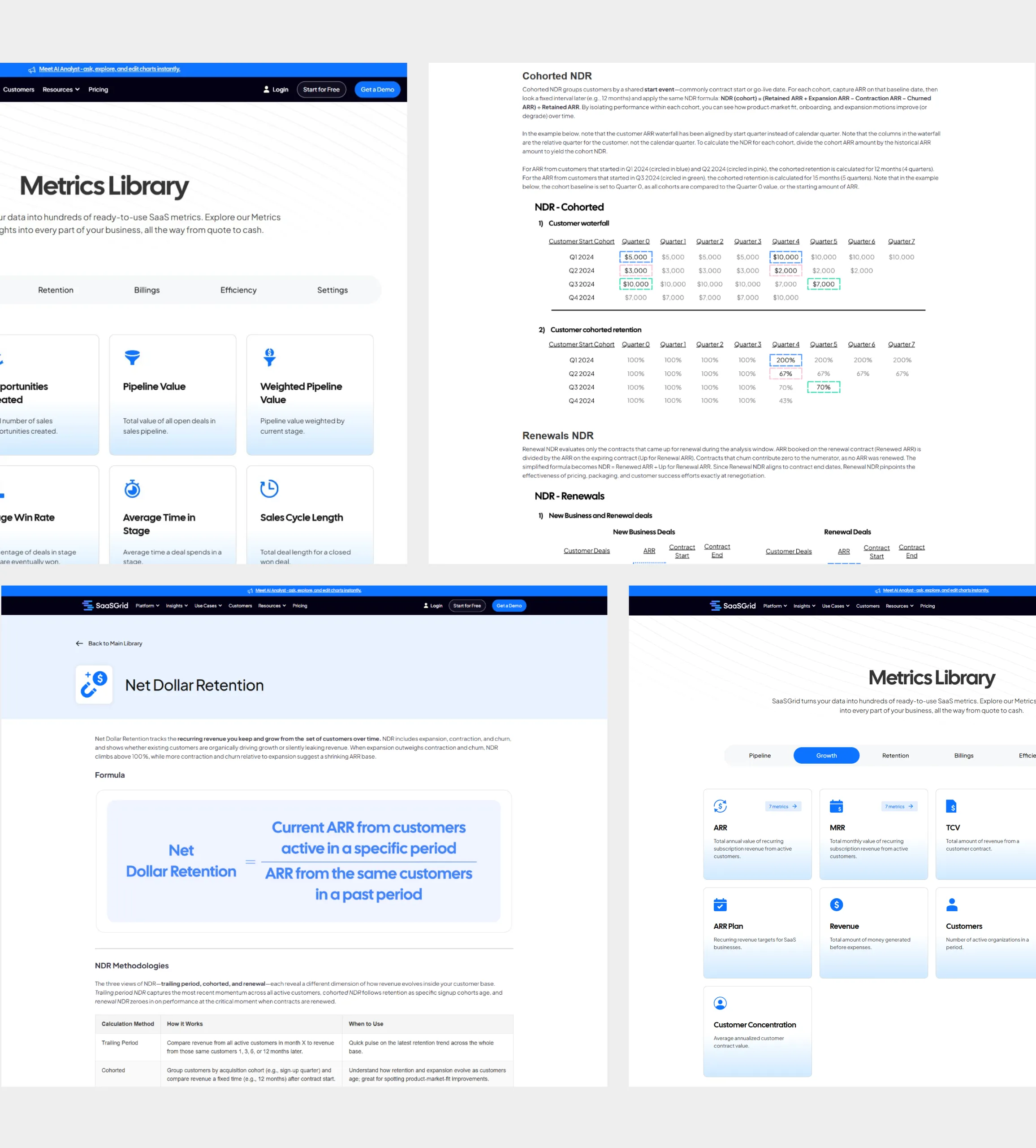
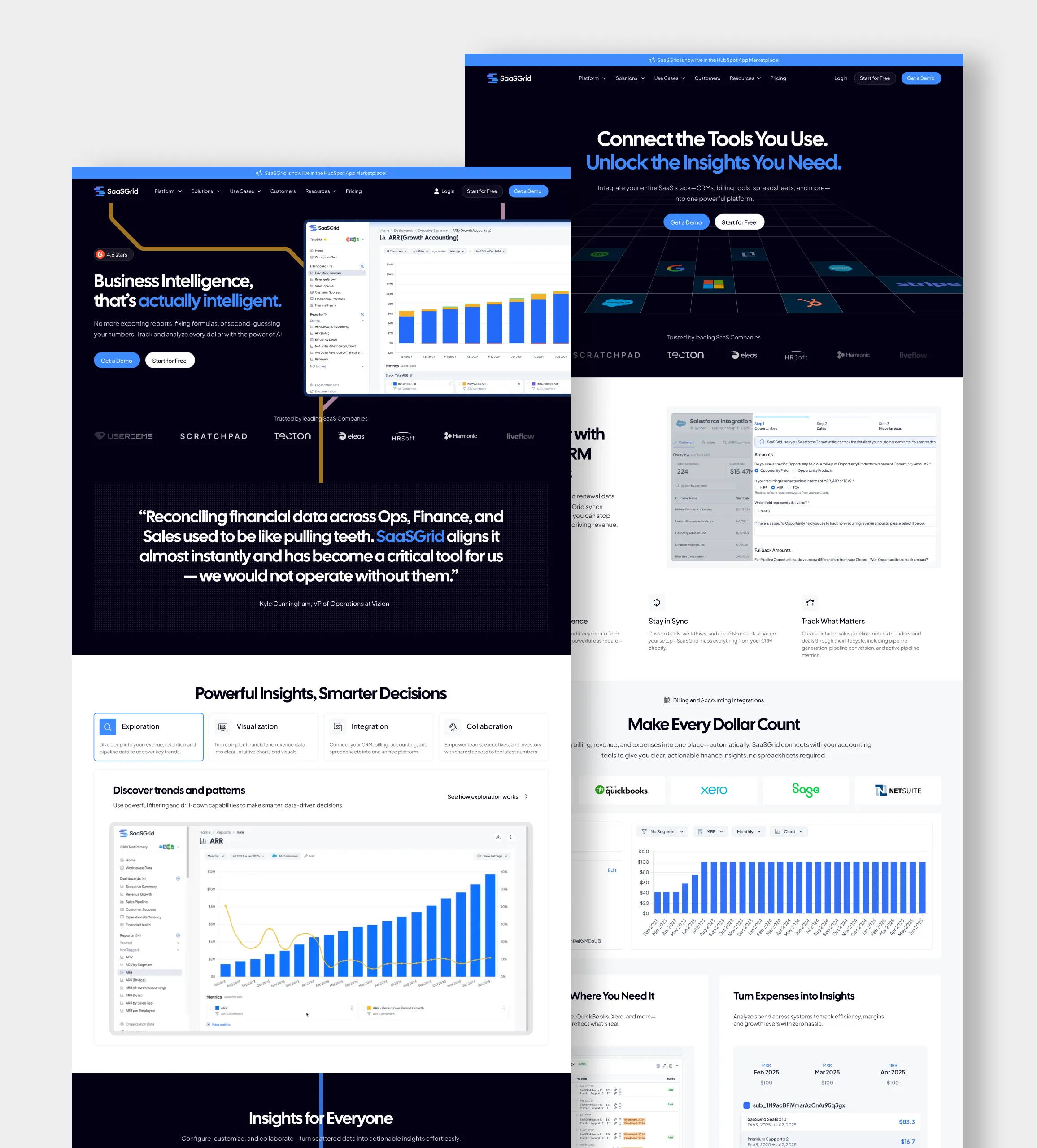
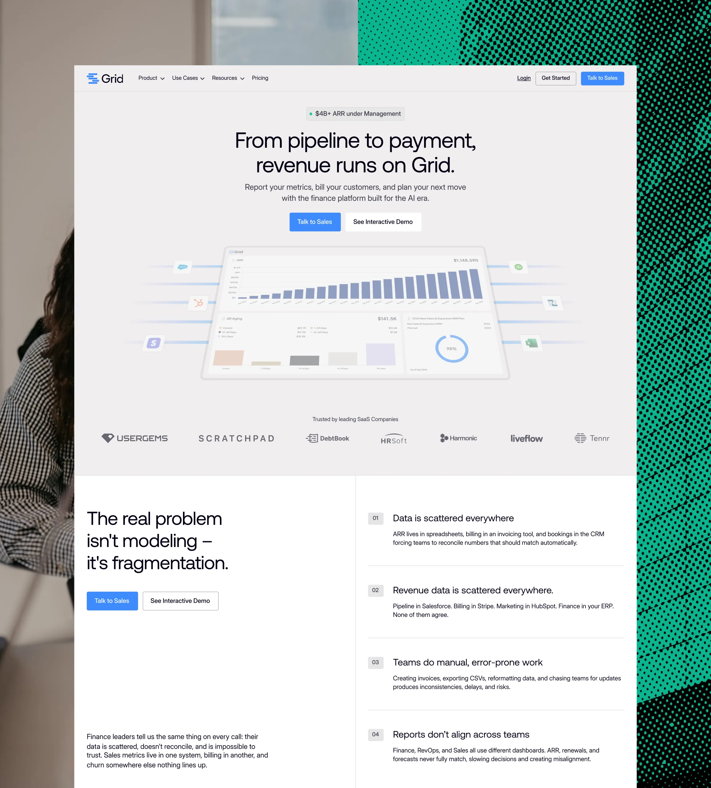
Our partnership with Grid has evolved alongside their product and brand. What began as a focused onboarding and development engagement grew into a full website revamp, and now a complete brand transformation. As Grid enters its next phase of growth, we continue to support how the product is positioned, experienced, and scaled.
Grid onboarded us for initial page development and foundational improvements to support their early product and marketing needs. This phase focused on speed, clarity, and setting a solid base for future growth.
As Grid scaled, they trusted us to lead a complete website revamp. We reworked the structure, design, and experience to better reflect the product’s value and support a more mature go-to-market motion.
With Grid entering its next phase of growth, we partnered again to lead a complete brand transformation — including a new identity, logo, and website. This ongoing collaboration is focused on redefining how Grid shows up as a more established and scalable SaaS product.

.webp)
.svg)
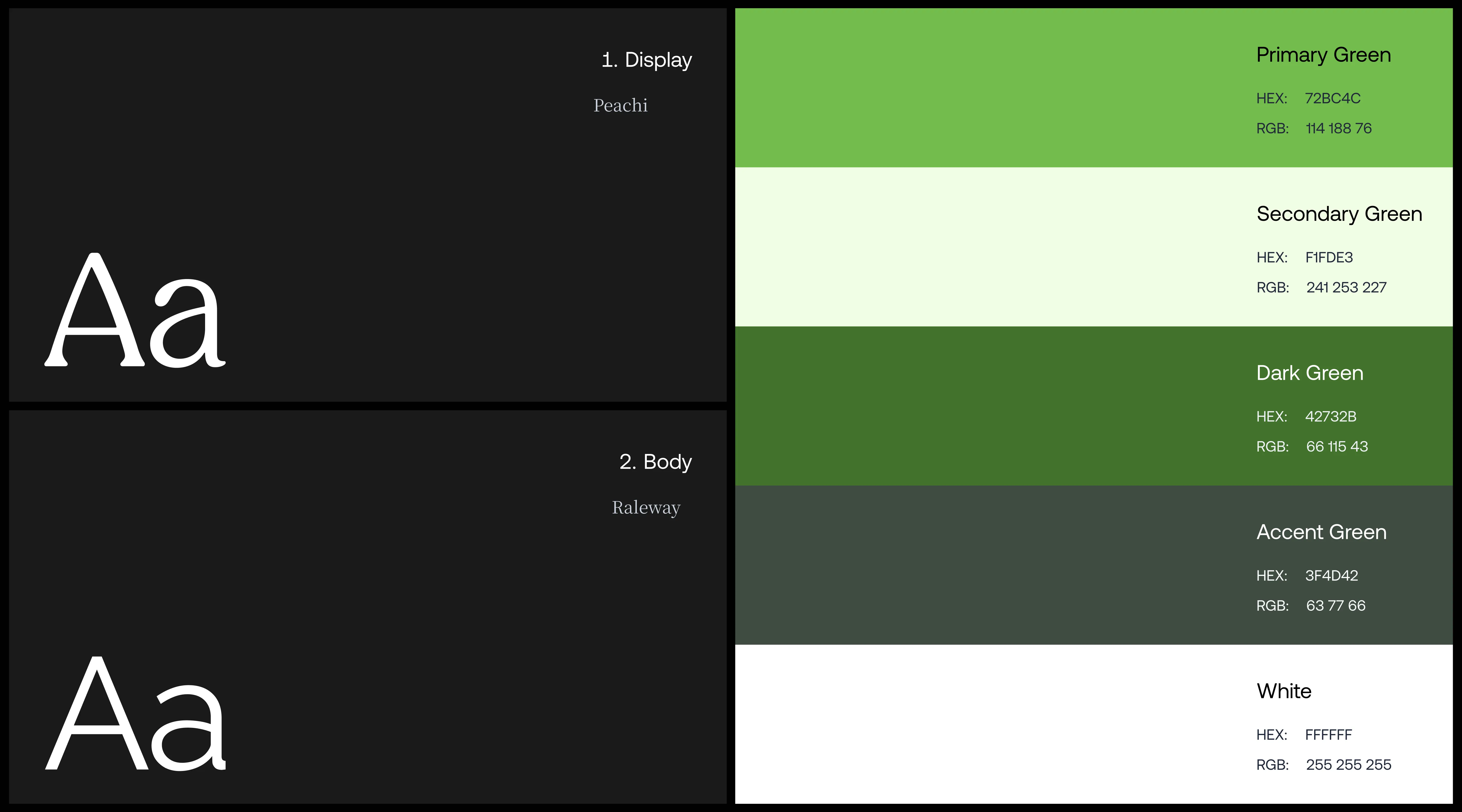
We defined Pickle’s brand identity through a curated blend of two fonts, Peachi and Raleway. This combination evokes a subtle sense of elegance, exuding sophistication and professionalism. This dynamic synergy is a powerful symbol of Pickle's ambition to present itself as an iconic name within the fashion industry while driving community engagement among members.
.webp)

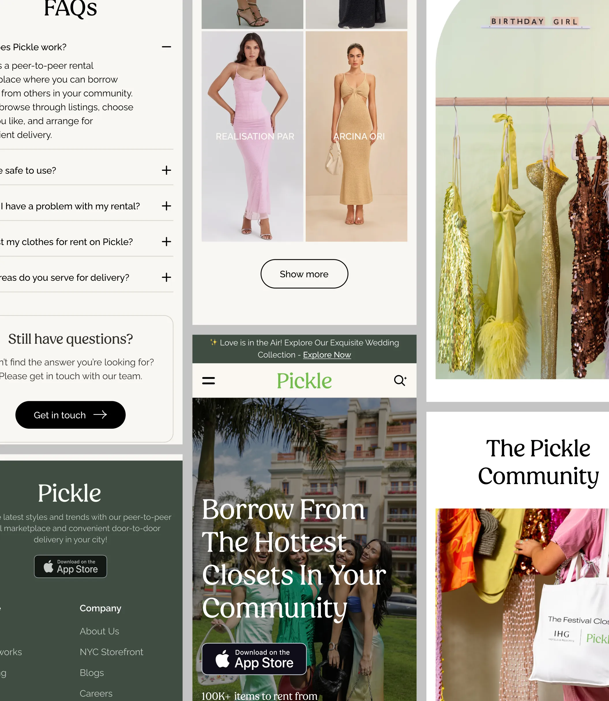
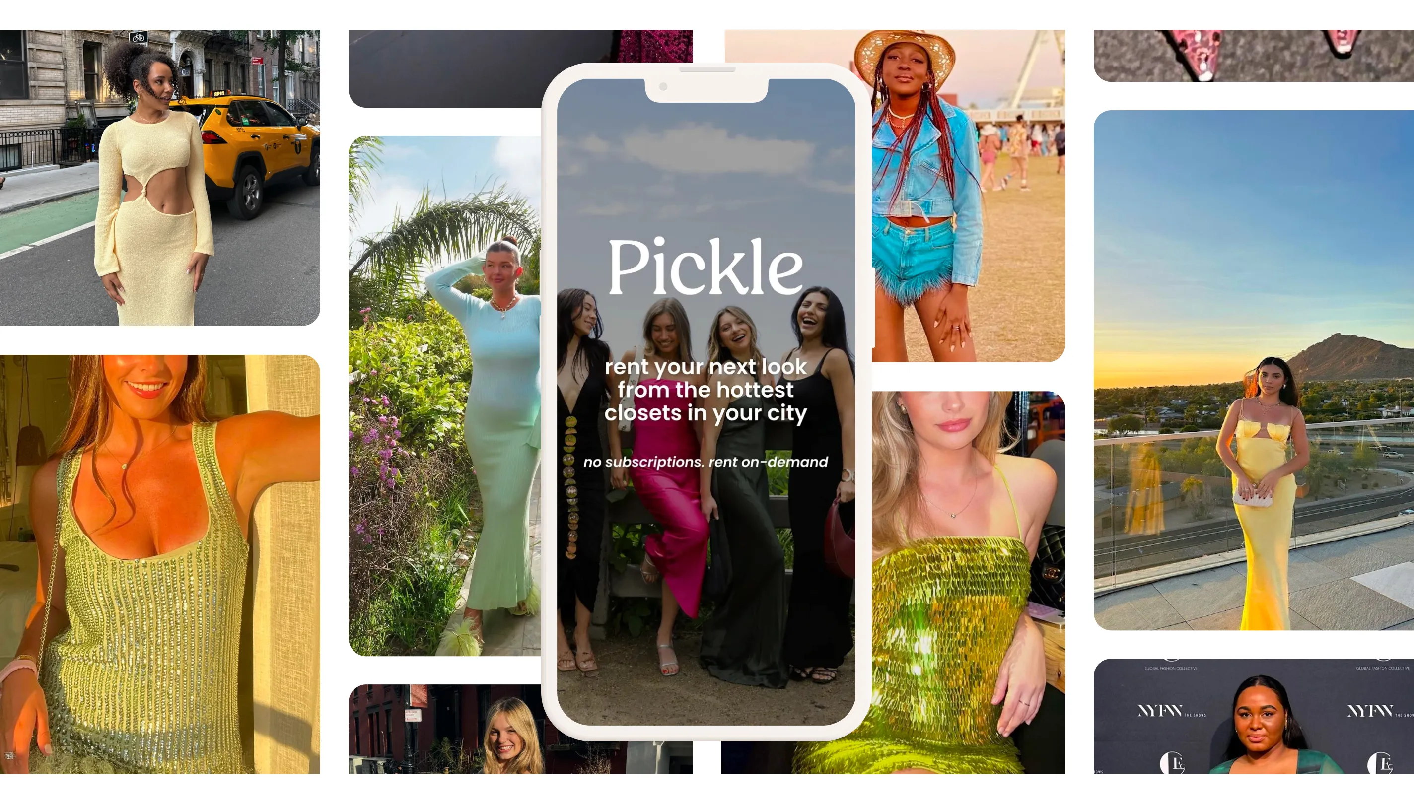
Pickle’s growth is powered by creators who showcase real outfits in real life. Influencers and community members bring the product into motion, turning everyday closets into discoverable wardrobes. This creator-led approach builds trust, drives visibility, and makes peer-to-peer rental feel aspirational without losing authenticity.
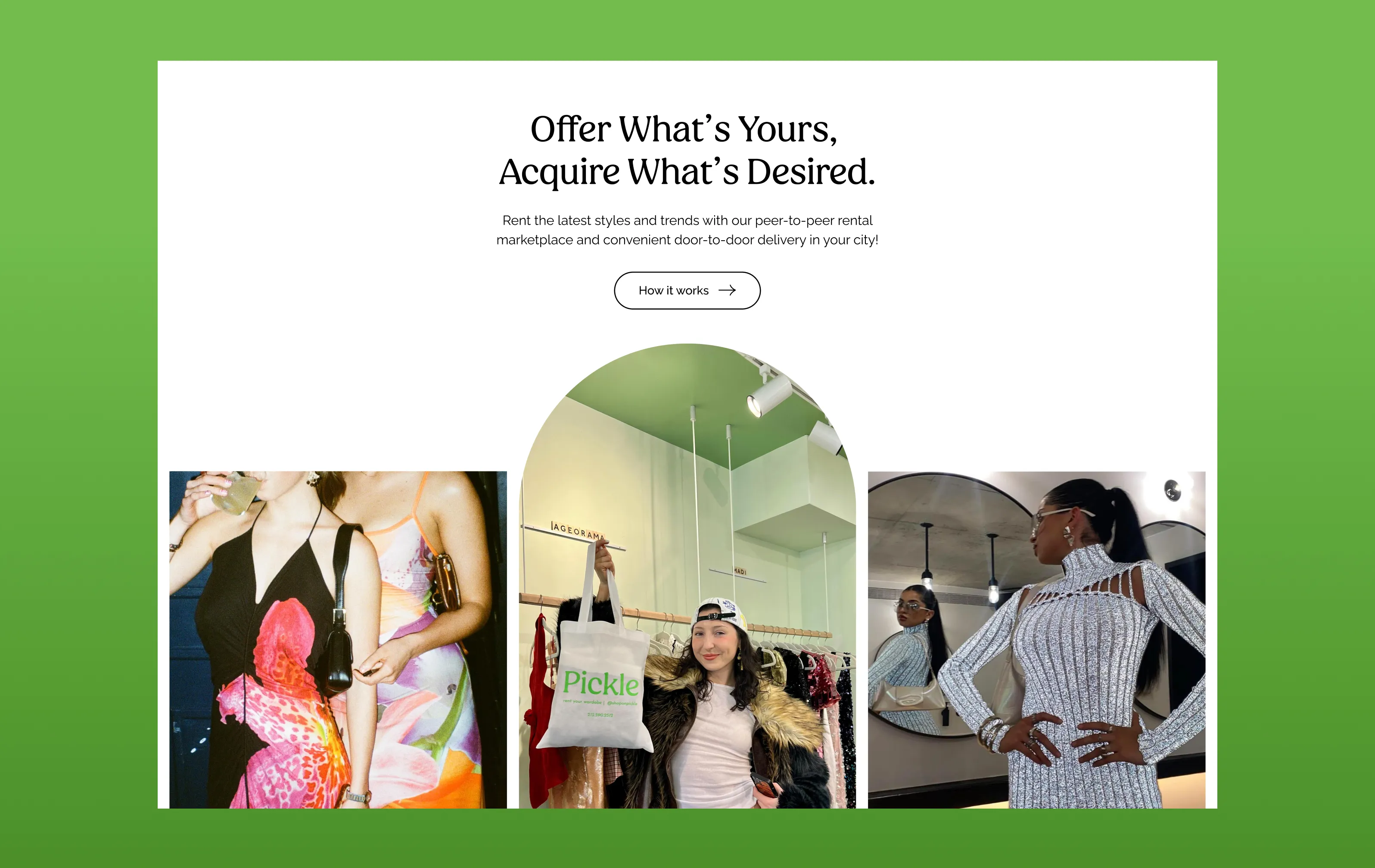
Pickle translates circular fashion into a seamless, mobile-first experience. Users can browse, lend, and rent with ease through curated collections, intuitive filters, and secure workflows. Every interaction is designed to feel familiar and social, helping users discover real pieces from real closets while keeping the experience effortless and community-driven.
At the core of Pickle is a vibrant network of renters, lenders, and local tastemakers. As the platform expanded, so did the culture around it—users engaging not just to access new looks, but to earn, connect, and express themselves. This community-powered model fuels organic growth and turns Pickle into more than a marketplace.
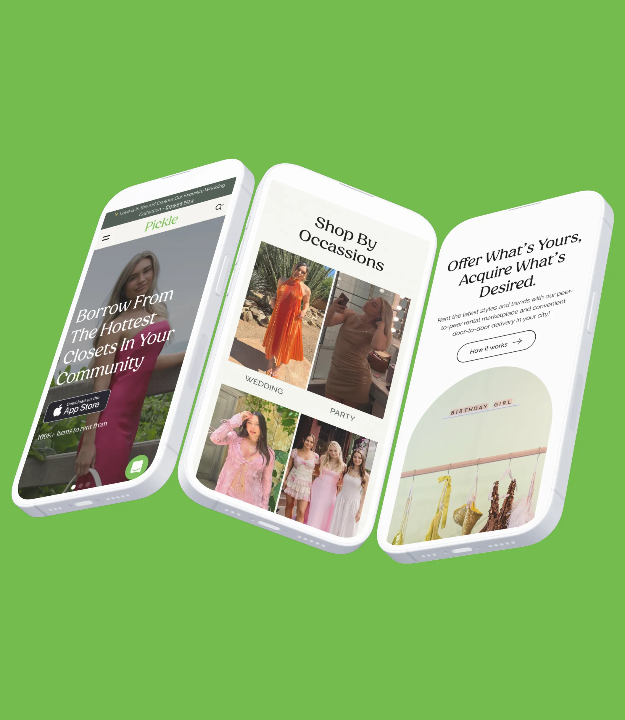
Strategic CRO improvements focused on clarity, hierarchy, and guidance through the rental journey. Refining CTA placement, visual contrast, and informational cues helped users move more confidently from discovery to action. A consistent color system and typography structure reinforced trust and improved retention across key touchpoints.
.jpg)
.png)
.png)
.png)
.png)
Design and CRO updates delivered measurable improvements across engagement and conversion. By refining the customer journey and reducing friction at key decision points, Pickle saw stronger performance from new visitors while maintaining a consistent brand experience across web and mobile.
.webp)
.svg)
“Brickell was awesome to work with. They gathered requirements quickly and showed clear design direction throughout the process. The time from project start to launch was impressive.”
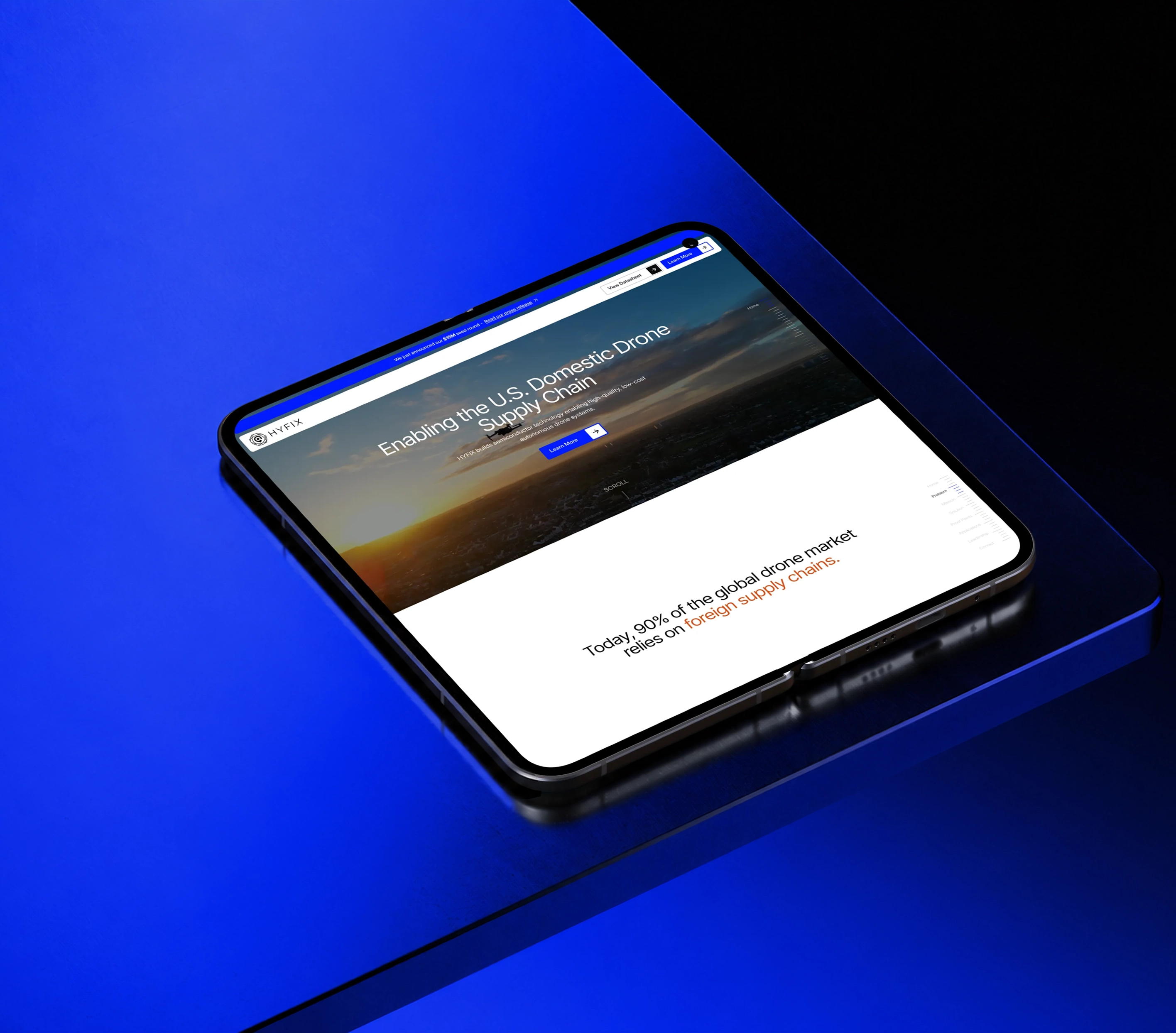
HYFIX builds spatial intelligence hardware and autonomous positioning systems for next-generation robotics and drones.
HYFIX builds spatial intelligence hardware and autonomous positioning systems for next-generation robotics and drones.

Twelve AI connects workflows, policies, and daily operations into one structured system for modern dental groups.
Twelve AI connects workflows, policies, and daily operations into one structured system for modern dental groups.
.webp)
B2B software and marketplace investor partnering with SaaS founders to scale recurring revenue, efficiency, and durable growth.
B2B software and marketplace investor partnering with SaaS founders to scale recurring revenue, efficiency, and durable growth.
.webp)
VC fund led by former corporate investors, giving founders access to enterprise customers, partners, and capital.
VC fund led by former corporate investors, giving founders access to enterprise customers, partners, and capital.