.svg)


.svg)


Counterpart Ventures


Backing Bold Founders Building the Future
.png)

.png)
.png)
.png)
+
%
+
%
+
%
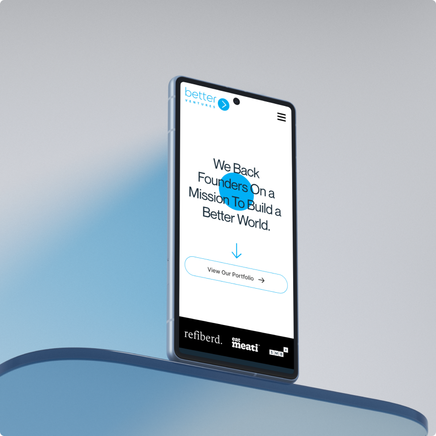
Counterpart Ventures came to us for more than just a visual upgrade - they needed a complete digital rethink. We tackled the project end-to-end, from defining brand architecture to optimizing for conversion, all wrapped in a high-performance Webflow build.
What we did:
- Defined the Brand Architecture: Clarified positioning, messaging, and tone to align with their unique investment thesis.
- Optimized for Conversion (CRO): Streamlined user flows and designed clear CTAs to guide visitors toward action - from founder outreach to investor interest.
- Crafted a Future-Proof Design System: Designed a sleek, scalable UI rooted in clarity, consistency, and Counterpart’s bold personality.
- Built Seamlessly in Webflow: Developed a responsive, fast-loading site in Webflow that gave the Counterpart team full control post-launch.
- Ensured Consistency Across Touchpoints: From color to copy, we made sure every interaction reinforced the brand’s credibility and edge.
.png)
The graphics included promotional posts, event countdowns, participant spotlights, and highlights of key activities. Each design was optimized for various platforms, ensuring clarity and engagement whether viewed on mobile or desktop. This cohesive and visually striking online presence helped amplify the Buildathon's message, attract participants, and build a vibrant online community around the event.
.png)
Our team ensured that each printed material was not only visually engaging but also functional and informative, guiding participants and creating a cohesive event experience. The use of the vibrant color palette and modern fonts ensured that all printed assets stood out, reinforcing the dynamic and innovative spirit of the Buildathon in every physical touchpoint.
.png)
.png)
.png)
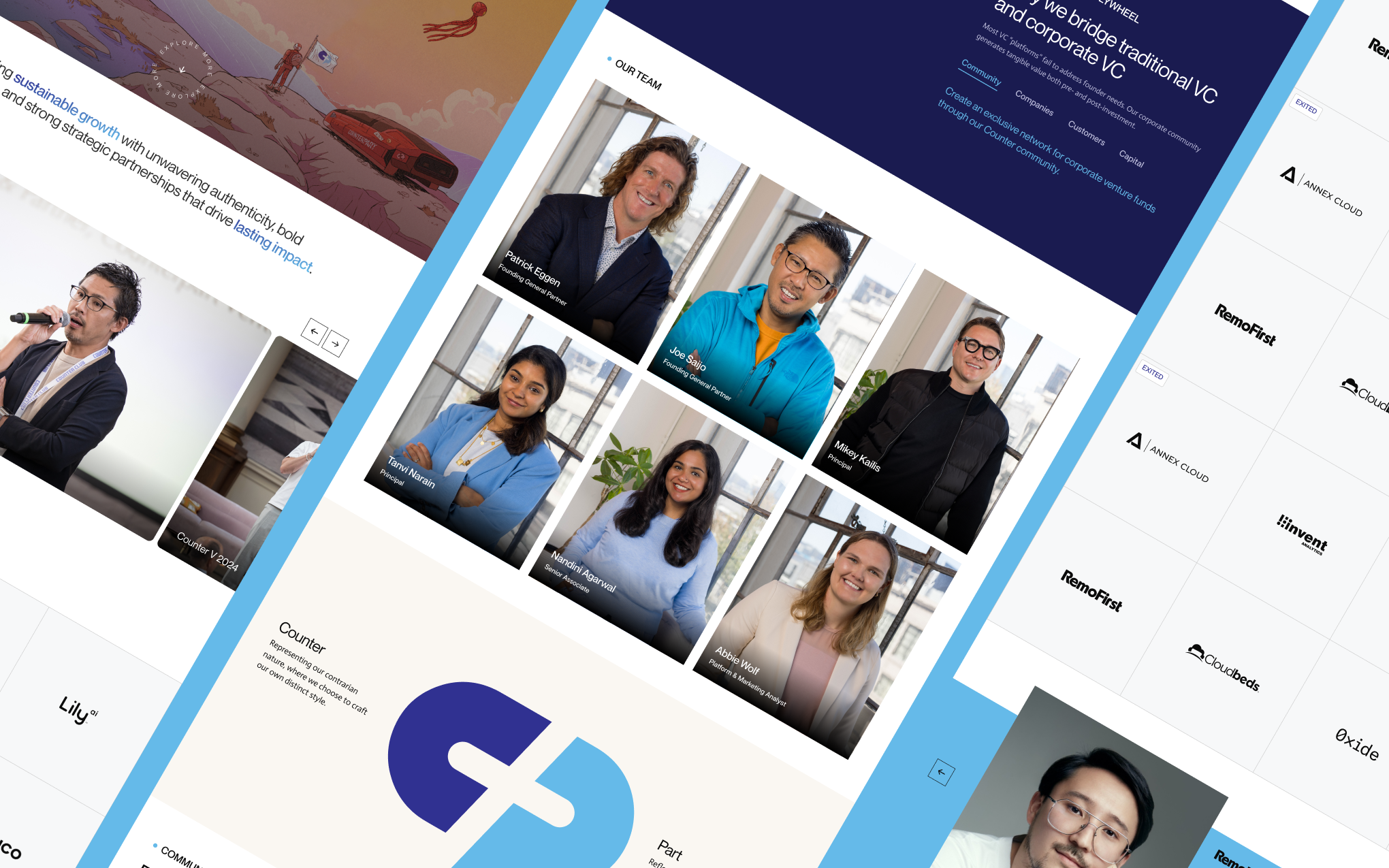
Designing for a venture capital firm isn’t about being flashy - it’s about building trust, conveying clarity, and standing out in a sea of sameness. With Counterpart Ventures, we saw an opportunity to challenge the typical VC look by leaning into bold visuals and sharp messaging that matched their no-nonsense, founder-first ethos.
We learned that simplicity wins when paired with a strong brand voice and intentional design. Every layout decision, color choice, and micro-interaction was crafted to reflect the confidence and conviction Counterpart brings to every investment.
.png)
.png)

.svg)