.svg)

Open five SaaS products.
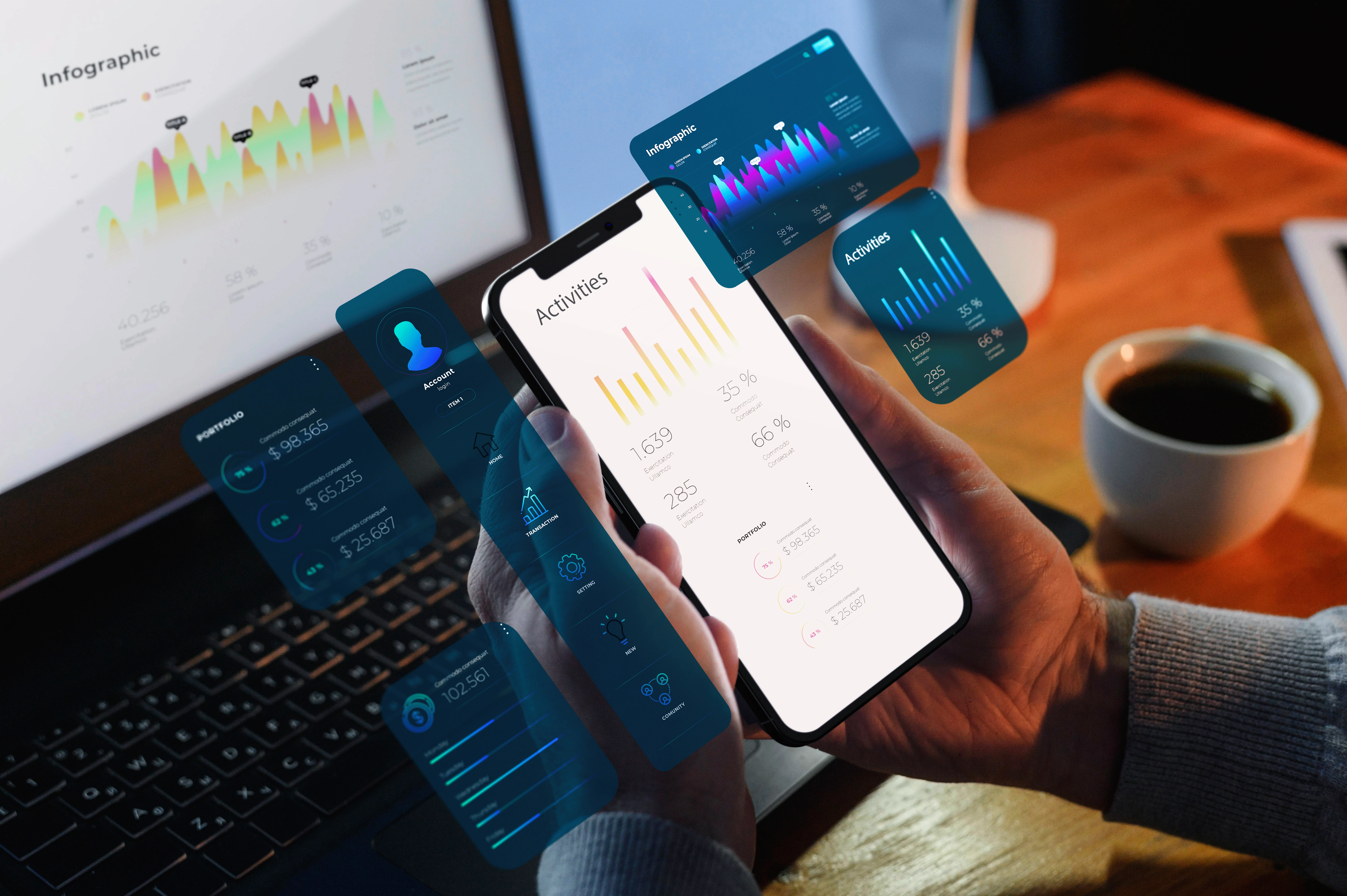
Look at their dashboards.
You will likely see:
- Rounded cards
- Soft shadows
- Muted color palettes
- Clean typography
- Minimal navigation
Everything looks polished.
Everything looks modern.
And everything looks… the same.
This is not a design problem.
It is a differentiation problem.
Because when interfaces start to look identical, usability becomes invisible.
And when usability becomes invisible, so does your product.
How We Got Here
Modern UI trends did not appear by accident.
They emerged from good intentions:
- Simpler layouts
- Better readability
- Cleaner visual hierarchy
- Reduced cognitive load
Design systems improved consistency.
Component libraries accelerated development.
Frameworks standardized patterns.
All of this made products easier to build and easier to use.
But it also introduced something unexpected.
Uniformity.
When everyone uses the same:
- Design frameworks
- UI kits
- Layout patterns
- Interaction behaviors
Products begin to feel interchangeable.
Not confusing.
Just forgettable.
Clean Does Not Always Mean Memorable
Clean interfaces reduce friction.
That is good.
But when everything is equally clean, nothing stands out.
Users do not remember:
- Another clean dashboard
- Another card layout
- Another sidebar navigation
They remember:
- Distinct workflows
- Clear structure
- Confident interaction patterns
Memorability is not about decoration.
It is about clarity and structure.
And that is where many modern interfaces fall short.
They look clean.
But they do not feel distinct.
When Design Trends Become Defaults
Certain patterns now appear everywhere:
- Left sidebar navigation
- KPI cards at the top
- Table-based content below
- Filters and search in the header
This is not inherently wrong.
In fact, these patterns work.
But when every product follows the same structure, the experience begins to blur.
Users may not confuse your product with another.
But they also do not remember why yours felt different.
And in competitive markets, that matters.
Because differentiation does not only happen in messaging.
It happens in experience.
Distinctive Interfaces Feel Intentional
The most memorable products do not always look radically different.
They feel intentional.
That can come from:
- Unique navigation logic
- Strong information hierarchy
- Clear interaction priorities
- Confident layout decisions
Not complexity.
Not decoration.
Just clarity with personality.
When an interface feels intentional, users notice:
"This product feels easier."
"This workflow makes sense."
"This feels designed for me."
That is where usability becomes visible again.
The Risk of Playing It Too Safe
Modern UI trends encourage safe decisions:
- Neutral colors
- Minimal typography
- Standard layouts
- Familiar components
Safe design reduces risk.
But too much safety removes character.
And when character disappears, differentiation disappears with it.
Your product might still be usable.
But it becomes harder to remember.
And harder to choose.
Distinction Is Becoming a UX Advantage
As UI patterns converge, differentiation shifts.
It moves from:
Visual style
To:
- Interaction design
- Workflow clarity
- Structural thinking
The advantage is no longer who looks modern.
It is who feels clearer.
Because clarity is easier to remember than aesthetics.
And memorable experiences drive preference.
When Every Interface Looks the Same
Users do not consciously notice visual sameness.
But they feel it.
They stop remembering products.
They start comparing features instead of experiences.
They rely on pricing and brand familiarity.
That is not where most companies want to compete.
Because once the interface disappears, your differentiation has to work harder elsewhere.
And that is a much tougher position to be in.
The Shift
Modern UI design solved many usability problems.
Now, it is creating a new one.
Sameness.
The next wave of product design will not be about making interfaces cleaner.
It will be about making them clearer, more intentional, and more distinct.
Because when every interface looks the same,
the ones that feel different become easier to choose.
.png)
.png)
.png)